
The Life and Opinions of Tristram Shandy, Gentleman
A Practice for Everyday Life
THE LIFE AND OPINIONS OF
TRISTRAM SHANDY, GENTLEMAN

The Life and Opinions of Tristram Shandy, Gentleman was originally published in the late 18th century in nine volumes, and has since been published in over 120 different editions. At a time where printed texts for a ‘mass’ audience were only just replacing manuscripts and oral performance, this book stands out as remarkably visual and modern for its time. Printed books made it possible to give words and ideas a durable and substantial form, in multiple identical copies of the same.
In this autobiographical novel, Laurence Sterne narrates, through the maverick character Tristram Shandy, the struggle of writing and publishing the very book in your hand. Publishing made it possible for Sterne to reach a large number of people who would be the readers and audience to the political and conceptual subtexts within.
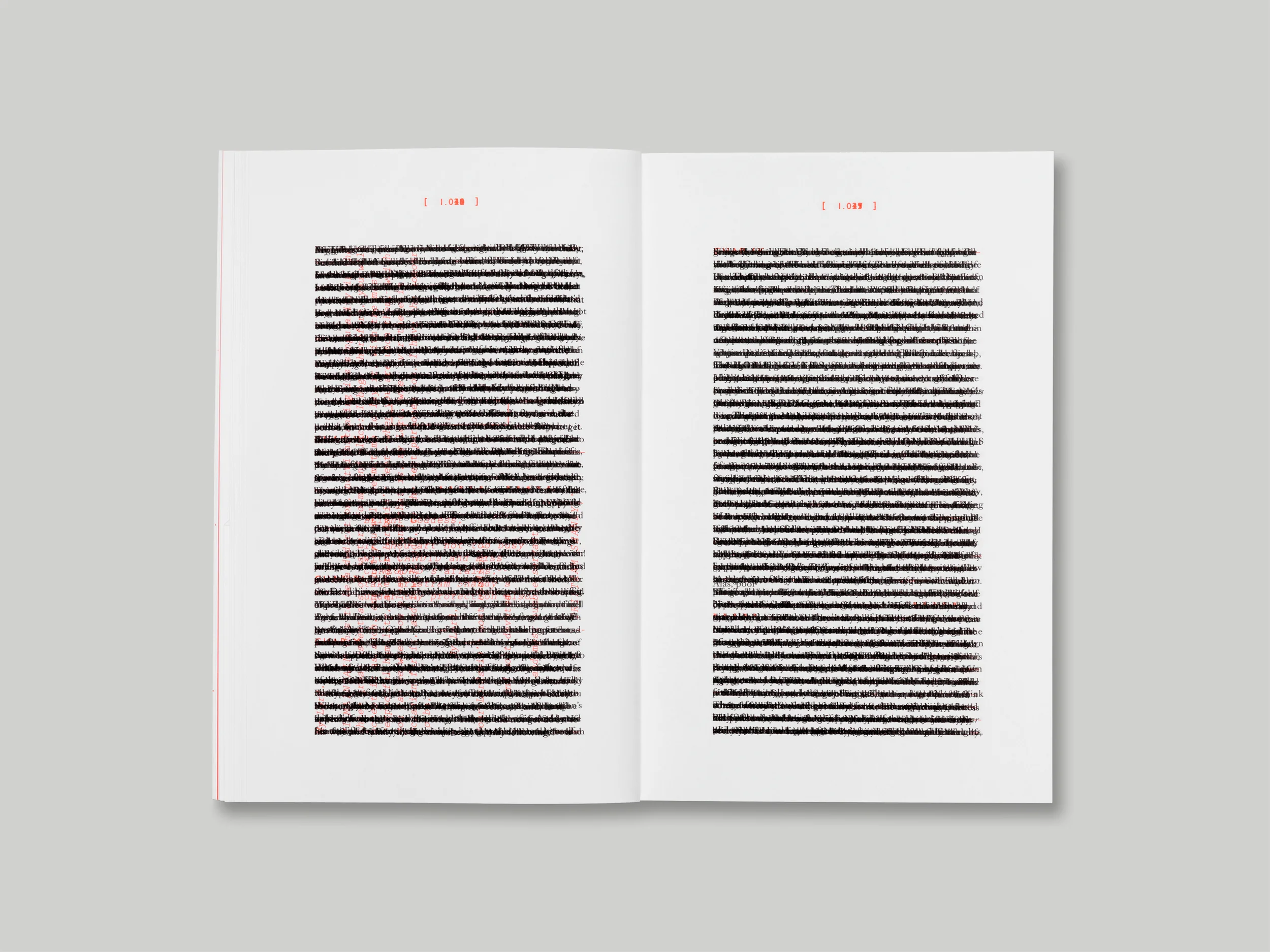
The physical appearance of the text on the pages of the first edition – its typography – is inseparable from the text itself. Comparing the first and most recent editions also tells another story of the developments in the printing and publishing industry. In 1759, when the first edition was published, every letter was typeset in metal – every page was considered and typeset by hand before being printed by letterpress. This process, and the approach of the author at the time, meant that every page was considered both visually and textually. It also meant that the original book has a particular strong object quality to it – something which has been lost in more recent editions, mainly due to contemporary economies of mass publishing, digital typesetting and web-offset or offset lithography printing processes. Such a visual approach and concept for the text pages of a book is rarely seen now outside of art books or poetry.


The visual elements in the book aren’t just decorative, they are inseparable from the text itself. Sterne doesn’t only use words to tell the story, but also other devices and characteristics inherent in a book from the character to the paper. The length of the en dashes and em dashes are used to describe a pregnant pause, or an impatient wait. Asterisks are used in place of expletives – often repeated for longer than a page if he’s really upset or his mind is full of dirty words. Small arrows, flowers and icons (fleurons) found in the letterpress printing rooms are incorporated cleverly and subversively into the text. At one point a chapter is described as missing, and then reappears at a later point. Another chapter is literally torn out of the book. These interventions, once you pick them up, become part of a language that can encourage the reader to look and read simultaneously, as two stories hand in hand. This way of ‘visual writing’ makes the text far more immersive.
At the beginning of Chapter VIII, Volume II, Tristram describes: ‘it is about an hour and a half’s tolerable good reading since my uncle Toby rung the bell’. Here, the duration of events are referring directly to the reader – projecting the order of the book onto the materiality of the pages as you are reading them yourself. There is then a strong connection made between narrator and the reader.
Some visual interventions are more obvious and have become iconic for fans of Tristram Shandy, such as the Marbled page and the Black page – a page printed with a solid black printing plate, which marks point in the text where the character Yorick dies. Both the Black page and the Marble page have page numbers which positions them to be ‘read’ like any other page. Marbling was a process often used in 18th Century book-printing on endpapers, but never before seen as a graphic ‘illustration’. Sterne refers to the marbled page as, ‘a motly emblem of my work’ – an illustration – its obscurity, colours, process are all considered and intended to be ‘read’. By placing this marbled page within the book rather than as a decorative endpaper where you would typically find it, you read into it as you would an illustration.
Every element of the book is a conscious design, from the author and publisher to the typesetter, an approach which is as possible now as it ever was. With this thoughtful and immersive approach to book design, every element of the typography, fold of the page, choice of binding or paper stock selection can communicate something more about the book’s content and its context beyond the text itself. To not embrace this approach is to miss a trick.
